Thursday, April 20, 2006
Windows Live - Are the Inmates Running the Asylum?
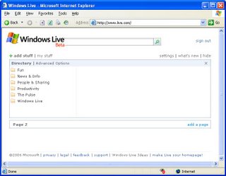
 This is horribly reminiscent of the ill-fated MSN Version 1 which Microsoft released back in 1995. For those of you who don't remember it, Microsoft attempted to "seamlessly" merge an online service with Windows. This was accomplished by organizing MSN into folders which were grouped with the user's hard-disk folders in Windows Explorer. All of this was tremendously cool from a technical perspective, but was extremely naive when it came to catering to the customer. Normal users just don't relate well to the Explorer view of the world.
Looking at the above home page, I haven't a clue where to start or what I can do. The user interface was obviously designed by a committee of programmers who were operating without adult supervision.
This is another example where it would help to follow Wyman's fourth law (see Wyman's Laws): If you can't think like a customer, you shouldn't be designing systems for them.
Sunday, April 09, 2006
User Interface Lessons from a Spaghetti Box
One of the staples on our menu is pasta. Over the years, the brand of pasta I used was, for the most part, irrelevant. For the past several years I have been using only De Cecco pasta. Supposedly, its bronze dies make for a superior pasta, to which sauce has a propensity to stick.
Tonight, it dawned on me that De Cecco has another attribute which makes it superior: its packaging. The three most important things I look for on a box of pasta are:
- The brand -- I certainly don't want to buy Guido's no-name pasta
- The type -- if I'm making linquine with clam sauce, I don't want cappelini
- How long to cook it -- pasta needs to be cooked "al dente", which requires accurate timing
Look at your average box of pasta. You'll certainly have no trouble identifying the brand. Not only is it printed prominently on the box, the coloring and graphics make it a no-brainer.
Most pasta types have standard names. Occasionally, you'll find obscure names, like tortiglioni. All pastas seem to have the name printed all over the box. De Cecco, and some others, also have a window which allows one to see the actual product. Thereby satisfying both the left and right brainers among us.
Finally, De Cecco seems to be unique in telling the user how long to cook the product. Look on most pasta boxes and the cooking directions are buried among recipes for obscure dishes, nutritional details and company history. De Cecco, on the other hand has the cooking time right on the front of the box, in large type. One cannot possibly miss it.
So what does this have to do with user interfaces? Simple - if the most frequently used information and controls do not stand out, you are interfering with the user's ability to get the job done.