Tuesday, August 01, 2006
When Your Code Doesn't Work, Make It the End-User's Problem

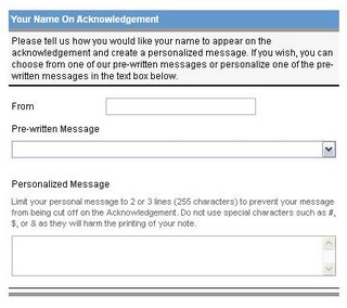
The instructions for including a personal message states "Do not use special characters such as #, $, or & as they will harm the printing of your note." Is it that the American Heart Association has been the recipient of a bunch of donated, dysfunctional printers which choke on special characters?
Not really. The underlying problem is that special characters passed between programs frequently require "escaping" using a protocol which both programs must implement. If one end implements the protocol and the other end doesn't, then strange things will happen. A little bit of experimentation with the donation page showed that use of a # or & would truncate the message at the point of the special character. This was obvious on the "preview" page -- no printing was necessary!
So obviously, the implementers of the Association's donation application hadn't a clue as to the proper way to handle special characters. I can just imagine the following conversation:
Head of Solicitations: We've been getting complaints from donors about their personal messages being incomplete.
Programmer: By any chance did they use any special characters in their message?
Head: How should I know?
Programmer: Well, they shouldn't. This is a known problem with the XYZ for Java Package and there's nothing we can do about it. [Notice the deft shift of the blame to a third party].
Head: Well then we at least ought to tell our donors not to use the characters.
Programmer: Ok, I'll get right on it and change the instructions on our Web site.
So we've now shifted the burden to fixing the problem onto the customer.
Tuesday, July 04, 2006
This Works - Thermos Gas Grill Parts
I was pleasantly surprised when I got home and unpacked my new Thermos grill. There, neatly arranged in a blister pack was all the hardware, organized and clearly labeled. Nice job, Thermos!

Thursday, June 15, 2006
Florida to Allow Citizens to Freeze Credit Reports
From the article:
Credit bureaus caution that consumers might not like a freeze because the process will involve sending certified letters to each credit bureau and proof of identification.
Once it is in place, a credit freeze is a complete block that could hamper your own access to your report. With a frozen credit report, you might not be able to take out a loan or get instant credit at a retail store or obtain a cell phone contract.
So the credit bureaus think this is a bad idea because it will make it difficult for you, the consumer, to get credit in your own name. Instead, the bureaus would prefer the current system where it is very easy for not only you, but anyone else who knows some information about you, to get credit in your name. Credit bureaus make money by selling credit reports. If you freeze your report, they won't be able to sell it. It is obviously in the bureaus' best interest to make the freezing process as painful as possible.
I, for one, would certainly like to excercise more control over who sees my credit report. The current system, with its heavy reliance on the Social Security Number (SSN) as the "key" to granting credit in your name, is very much broken. Permitting you to freeze your credit account, requiring better security in those systems which store personal identifying information about you and requiring disclosure if your personally identifying information has been compromised don't address the real issue.
How might one fix the system? Well, how about automatically giving each consumer a PIN as the key to their credit bureau account. This PIN, when combined with the other identifying information, would allow a credit grantor to view the consumer's credit history. For added security, this PIN could be made "single-use". That is, it would expire after a single credit grantor employed it. Even without the single-use feature, merely being able to issue a new PIN, much the same way you are issued a new credit card number if your card is lost or stolen, should minimize fraud.
Or, better yet, why not turn over the whole identity management process to a credit card company? They have certainly proven themselves adept at managing fraud. The primary reason, of course, is that they are held liable for fraudulent card use (or at least that in excess of $50). Until the credit bureaus and credit grantors are held similarly liable, they are under no incentive to "fix" the current system.
Monday, May 15, 2006
Quote of the Day
There are two kinds of legal departments in large companies: (a) the kind that automatically says, “No,” when asked, “Can we do this?” (b) and the kind that automatically says, “No,” when asked, “Can we do this?”
I've also heard such departments referred to as the "Sales Prevention Team".
Thursday, May 11, 2006
Google Search Result Page Navigation - What Were They Thinking of?

Now to a programmer this is an intuitively obvious interface. Google's back end supports the ability to display search results starting with any random page, so why not expose this capability to the end user?
Unfortunately, from the end user's perspective, this makes no sense whatsoever. Google presents its search results ordered by how likely they are to be of interest to the user. If a user doesn't find what they need on page 1 they typically will follow one of two courses of action:
- Re-phrase their search terms and repeat the search (the approach I use 90% of the time)
- Go to page 2 to view the next most relevant set of search results
No user in their right mind would say to themselves "Hmmm, I didn't find what I was looking for on page 1. Let me see what's on page 4." But this is exactly what the Google interface supports.
The only navigation controls needed here are Next, Previous and First page.
Microsoft's Windows Live search (boy do I hate that name), does an excellent job of finessing this whole issue by supporting an "infinite scroll" feature. As the user scrolls through the result set using either the mouse wheel or scroll bar, the next search result set is automatically retrieved under the covers. This is very much analogous to how Google Maps supports panning which, compared to other map services which required page reloads to effect panning, represented a quantum leap in the interface.
Of course, Google's search thrives on light weight and speed -- something which has never concerned Microsoft -- so it's not clear if it makes sense for Google to apply heavy weight Ajax technology to their bread and butter.
Thursday, April 20, 2006
Windows Live - Are the Inmates Running the Asylum?
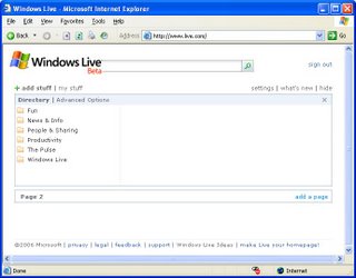
 This is horribly reminiscent of the ill-fated MSN Version 1 which Microsoft released back in 1995. For those of you who don't remember it, Microsoft attempted to "seamlessly" merge an online service with Windows. This was accomplished by organizing MSN into folders which were grouped with the user's hard-disk folders in Windows Explorer. All of this was tremendously cool from a technical perspective, but was extremely naive when it came to catering to the customer. Normal users just don't relate well to the Explorer view of the world.
Looking at the above home page, I haven't a clue where to start or what I can do. The user interface was obviously designed by a committee of programmers who were operating without adult supervision.
This is another example where it would help to follow Wyman's fourth law (see Wyman's Laws): If you can't think like a customer, you shouldn't be designing systems for them.
Sunday, April 09, 2006
User Interface Lessons from a Spaghetti Box
One of the staples on our menu is pasta. Over the years, the brand of pasta I used was, for the most part, irrelevant. For the past several years I have been using only De Cecco pasta. Supposedly, its bronze dies make for a superior pasta, to which sauce has a propensity to stick.
Tonight, it dawned on me that De Cecco has another attribute which makes it superior: its packaging. The three most important things I look for on a box of pasta are:
- The brand -- I certainly don't want to buy Guido's no-name pasta
- The type -- if I'm making linquine with clam sauce, I don't want cappelini
- How long to cook it -- pasta needs to be cooked "al dente", which requires accurate timing
Look at your average box of pasta. You'll certainly have no trouble identifying the brand. Not only is it printed prominently on the box, the coloring and graphics make it a no-brainer.
Most pasta types have standard names. Occasionally, you'll find obscure names, like tortiglioni. All pastas seem to have the name printed all over the box. De Cecco, and some others, also have a window which allows one to see the actual product. Thereby satisfying both the left and right brainers among us.
Finally, De Cecco seems to be unique in telling the user how long to cook the product. Look on most pasta boxes and the cooking directions are buried among recipes for obscure dishes, nutritional details and company history. De Cecco, on the other hand has the cooking time right on the front of the box, in large type. One cannot possibly miss it.
So what does this have to do with user interfaces? Simple - if the most frequently used information and controls do not stand out, you are interfering with the user's ability to get the job done.